Book tracking platform
Goodreads redesign

Goodreads is a very old book tracking tool. As an avid reader and a junior designer, I have decided to challenge myself by redesigning the landing page and some of the mobile screens for the app. Let’s go.
Timeline
The gathering of information and the redesign itself took two weeks.
Background
Goodreads is a simple tool that helps you keep track of how many books you have read from year to year, you can connect to your friends and other readers, and discover more books to add to your list. However, the app and the website have not been maintained in years and there are many features that are lacking or that could benefit both the user and the company. So here I will track my attempt in trying to redesign the landing page and some screens from the app by keeping some of the key features and maybe adding some new and trendy ones from the key competitors. Let’s see how it goes.
Challenges
Redesigning the landing page.
Redesigning a few screens from the app (at least 5 to form a flow).
Decide on the extend of the redesign (should I keep the same colour palette, typography, components.)
This category details the step-by-step approach taken during the project, including research, planning, design, development, testing, and optimization phases.
Define (issues with landing page)
Outdated Design: The overall layout and design feel dated, lacking the modern look and feel of contemporary websites, which can make it less appealing to new users.
Cluttered Interface: The page is often overcrowded with text, links, and multiple sections, leading to a lack of clear focus or hierarchy, which can overwhelm users.
Poor Visual Hierarchy: There is limited differentiation between key sections, making it difficult for users to easily identify the most important actions, such as signing up or discovering new features.
Navigation Overload: The navigation menu contains many links and subcategories, which can be confusing for users trying to quickly find specific content or features.
Lack of Engaging Visuals: The site is text-heavy with few high-quality visuals or engaging elements, which might make it less visually stimulating compared to competitors.
Limited Calls-to-Action (CTAs): The CTAs are not prominent or engaging enough to guide users toward the main conversion goals, such as signing up or exploring new books.
Unresponsive or Non-intuitive Design: The mobile experience is not as seamless as modern websites, with some elements not adapting well to smaller screens or touch interactions.
The app is barely advertised.These issues combined can lead to a less user-friendly experience and hinder user conversion. Below you can see a screenshot of the original website.
Design decisions
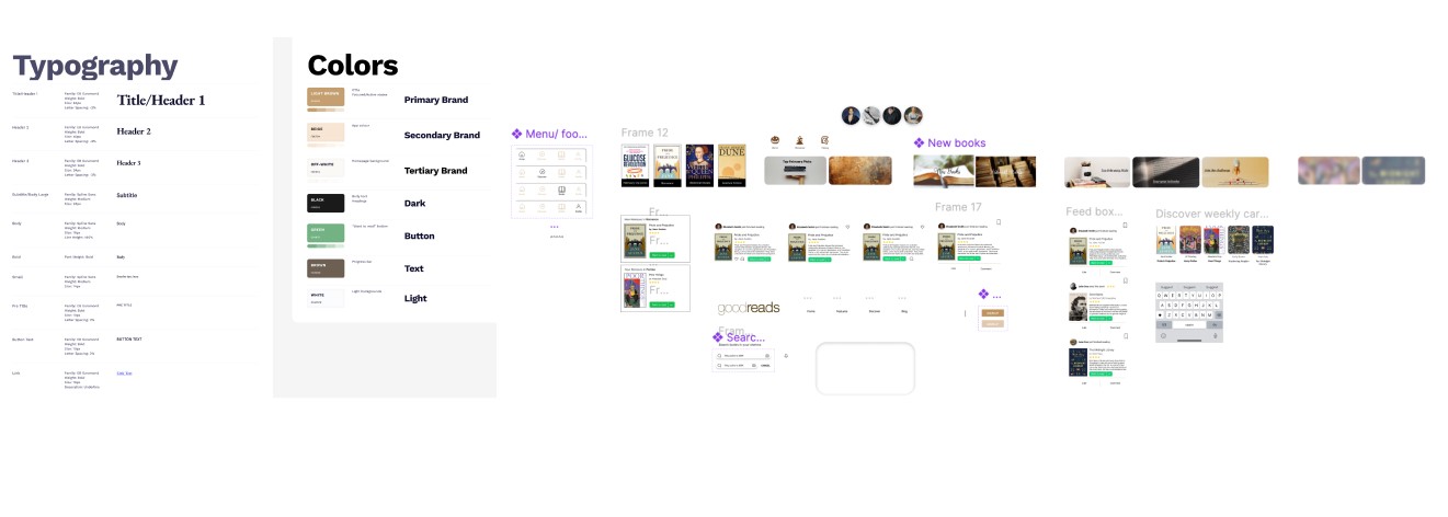
Colours - I decided to keep Goodreads colour palette, because it is calm and classic, and it is already known by the users. However, the palette itself consists too many colours (17 in total). I considered that too overwhelming for the user, so I used only 7.
Typography - Goodreads uses two font families: Lato (sans serif) and Merriweather (serif). I appreciate how the combination of a serif and a sans serif font creates a balance between the classic and the digital, evoking the experience of both reading a physical book and a digital one. I chose to maintain this concept but update the fonts with more modern alternatives. So I chose - Spline Sans and EB Garamond, because they work harmoniously in web design. EB Garamond brings an air of elegance and sophistication with its timeless serif style, evoking the charm of classic typography.
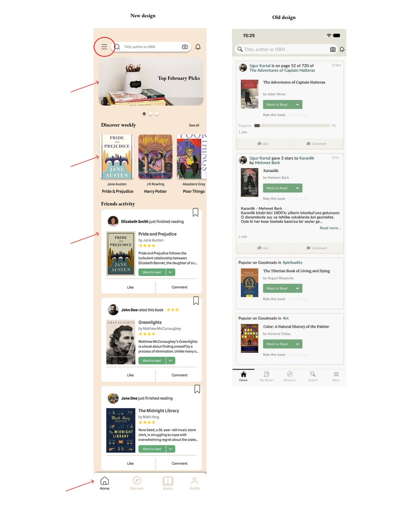
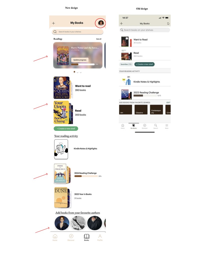
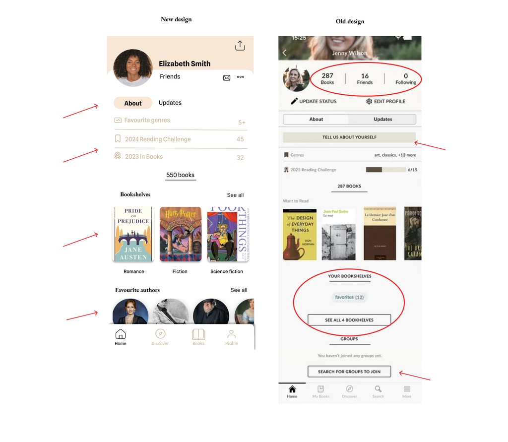
Define (issues with app)
The Goodreads app has some notable UI issues that users often point out:
Cluttered Interface: The app can feel cluttered, with too much information packed into a small space, making it overwhelming and difficult to navigate.
Inconsistent Design: The design elements and user interface can appear inconsistent, with different sections having varying layouts and styles, which can disrupt the user experience.
Poor Filtering and Sorting: The options for filtering and sorting books are sometimes limited or not very intuitive, making it harder for users to find specific books or organize their reading lists effectively.
Navigation Issues: Some users find the navigation confusing, with too many nested menus or unclear paths to access certain features or information.
Inadequate Search Functionality: The search function can sometimes be unreliable or not as powerful as users would like, making it difficult to find specific books or authors.

This was my first experience redesigning an app, and I found it quite fulfilling to tackle the information architecture and conduct an audit of the existing app.
I explored did a competitor analysis, then I explored the colours, typography, and performed which guided me in crafting a new UI for Goodreads.
Additionally, I enhanced my skills with Figma, I also learned how important it is to create a design system upfront, in order to keep the consistency of all pages. I made many mockups which I will not show, because the case study got too long, but I would definitely save much more time on my next redesign project!