Donation and exchange platform

Done

COMPANY

Done

ROLE

UX/ UI Design/ UX Research

EXPERTISE

UX/UI Design

YEAR

2022

Project description

Project description

Project description

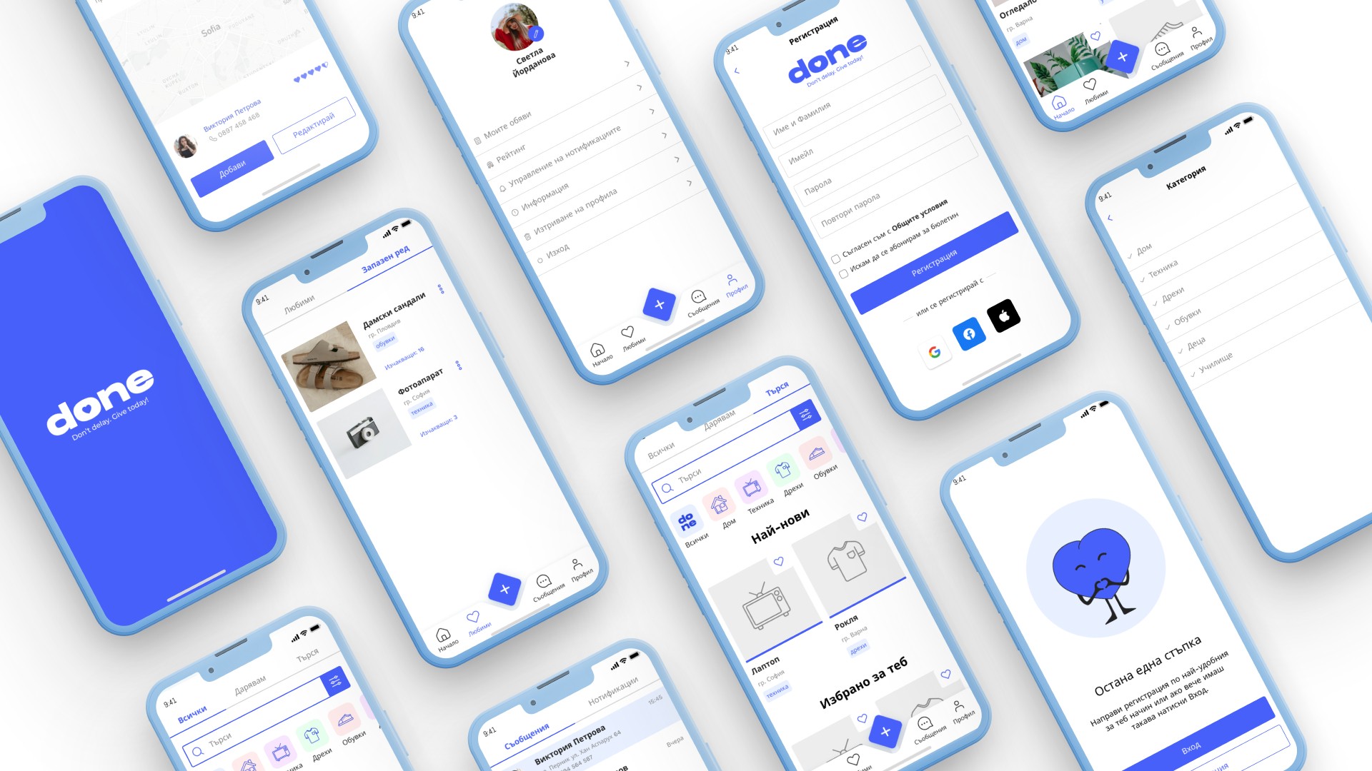
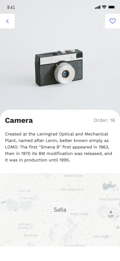
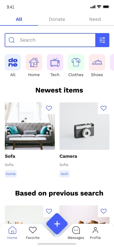
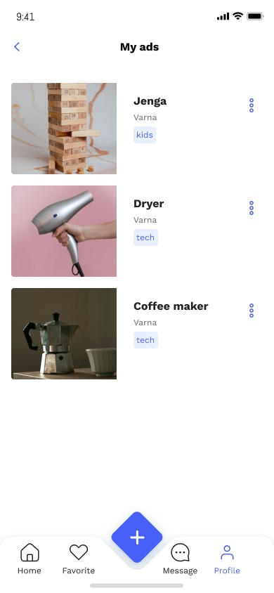
Done (Donate Online ‘N Exchange) is a platform created to assist people in donating and finding items. The platform is developed entirely for the Bulgarian market. The target demographics is for people the age of 18-65+. In the initial stage of the project, the platform will be used solely for donations and findings. In a future update, there will be also an option for exchange.

Timeline

The whole process took 3 months to develop, research, wireframe, prototype, test and finalise.

Problem statement

“Many people have no clue what to do with their unnecessary items, so they either keep them in storage or they throw them away and in this way contribute to landfills. This is a bad practice and hence why we’ve decided to help people in need and nature by creating a platform which fights this problem.”

Challanges

  • An app that connects donators and people in need in an easy matter

  • An app that is easy to navigate for elder people.

  • A simple and easy to use website for those who don’t have smart phones.

Phases

This category details the step-by-step approach taken during the project, including research, planning, design, development, testing, and optimization phases.

Discover phase

Quantitative Research - We created user survey in Google Forms, to determine our target audience and to gain a basic understanding of our users. About 200 responses were recorded. And based on the responses here are the key insights presented below
The survey confirmed that 91% of the people would like to use a donating platform.
- 88% of the people would rather use their phone to search or donate items.
- 55% of the people use a third party to donate (eg. The Red Cross etc.)
- 16% of the people throw away the items they no longer use.

In order to get a solid understanding of how our competitors are doing in the market and to lay out a solid foundation, we also did a competitor analysis which consisted of direct and indirect competitors.

Dеfining phase

We created three personas representing the main users of our platform which are The nature enthusiast, The activist, and The one in need.

Develop phase

We used a prioritisation matrix to decide on the most important features which would be included in the initial design. We made a survey in which we asked 180 users about their preferences using Likert scales. We created information architecture to understand the domain and how the basis of the app will look like.

Deliver phase

We followed the below steps in the design phase:
- Paper Sketches
- Low-fidelity wireframes with variations
- Moodboard
- Ideation
- Final Design

Phases

Phases

This category details the step-by-step approach taken during the project, including research, planning, design, development, testing, and optimization phases.

Discover phase

Quantitative Research - We created user survey in Google Forms, to determine our target audience and to gain a basic understanding of our users. About 200 responses were recorded. And based on the responses here are the key insights presented below
The survey confirmed that 91% of the people would like to use a donating platform.
- 88% of the people would rather use their phone to search or donate items.
- 55% of the people use a third party to donate (eg. The Red Cross etc.)
- 16% of the people throw away the items they no longer use.

In order to get a solid understanding of how our competitors are doing in the market and to lay out a solid foundation, we also did a competitor analysis which consisted of direct and indirect competitors.

Dеfining phase

We created three personas representing the main users of our platform which are The nature enthusiast, The activist, and The one in need.

Develop phase

We used a prioritisation matrix to decide on the most important features which would be included in the initial design. We made a survey in which we asked 180 users about their preferences using Likert scales. We created information architecture to understand the domain and how the basis of the app will look like.

Deliver phase

We followed the below steps in the design phase:
- Paper Sketches
- Low-fidelity wireframes with variations
- Moodboard
- Ideation
- Final Design

Testing

Testing

Testing

Before we started working on the interface design, we tested our prototypes with 8 users through unmoderated, live testing of our three main paths (adding and editing a listing, filtering listings by different categories) and more.

Goals

1) To test navigation and how users move around the app
2) Understand if the features are intuitive and easy to find
3) To find out if users like the app and would use it regularly

Results

1) 75% found the font to be too small
2) 88% cannot find the categories
3) 63% adding to favourites is too complicated

Takeaway

Takeaway

Takeaway

Throughout the duration of this project, I have gained a wealth of knowledge about the UX design process and the design thinking framework. In particular, I have come to appreciate the importance of research and constant ideation, as they are the foundation upon which the design steps later on. By conducting extensive research and iterating through several design iterations, I have been able to better empathize with our target users, taking into account their needs and pain points.

Additionally, I have had the opportunity to develop my skills in Figma, which has been an invaluable tool in the design process. Through the use of Figma, I have been able to create wireframes, prototypes, and high-fidelity designs that have helped me visualize and refine my ideas.

Overall, this project has been an incredible learning experience that has allowed me to grow both as a designer and as a critical thinker. I am grateful for the opportunity to work on a project that has the potential to make a real difference in people's lives, and I look forward to continuing to develop my skills and knowledge in the field of UX design.